
Reading time: 5 minutes and 21 seconds
Why work with creativate?
- Fixed project pricing - from just £499.
- 160 years combined team experience.
- All projects are completed in-house.
- Award-winning digital agency heritage.
- WordPress & WooCommerce Experts.
WooCommerce Mobile Shopping
Your customers are shopping on their phones. Not sometimes – most of the time. Over 70% of e-commerce traffic now comes from mobile devices, yet we still see WooCommerce stores that treat mobile as an afterthought. It’s like having a beautiful shop front but forcing customers to crawl through a letterbox to get inside.
The harsh reality? If your WooCommerce store doesn’t work brilliantly on mobile, you’re not just losing sales – you’re training customers to shop elsewhere. And once they’ve found a competitor who gets mobile right, good luck winning them back.
The Mobile Shopping Revolution
Mobile commerce isn’t the future anymore – it’s the present. Your customers are browsing products while commuting, comparing prices in physical stores, and making purchase decisions during their lunch break. They expect the same seamless experience they get from Amazon or ASOS, regardless of whether they’re shopping on a 27-inch monitor or a 5-inch phone screen.
The problem is that many WooCommerce stores are still designed with desktop in mind, then squeezed into mobile formats. This backwards approach creates clunky experiences that frustrate users and kill conversions.
Where Mobile WooCommerce Goes Wrong
Checkout nightmares are probably the biggest conversion killer. We’ve seen stores where customers have to zoom in and out just to complete their purchase, or where the payment forms don’t work properly with mobile keyboards. One client was losing 60% of mobile customers at checkout simply because the process was too frustrating.
Product browsing feels clunky when images don’t load quickly, categories are hard to navigate, or the search function doesn’t work properly on touch devices. Customers expect to swipe, tap, and scroll intuitively – not wrestle with your interface.
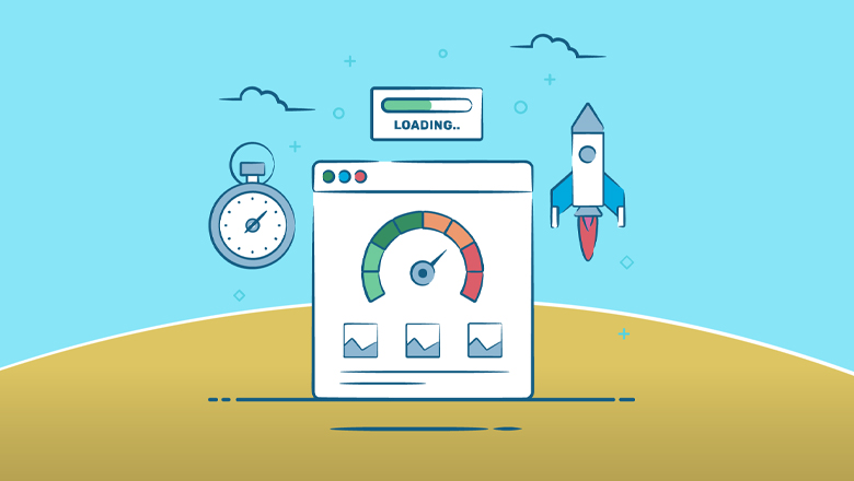
Loading speed kills everything on mobile. Desktop users might wait 3-4 seconds for a page to load, but mobile users abandon sites after just 2 seconds. If your product pages are heavy with unoptimised images and plugins, you’re hemorrhaging potential customers.
Touch-unfriendly design is everywhere. Buttons too small to tap accurately, links too close together, dropdown menus that don’t work on touch screens – these aren’t just minor annoyances, they’re business killers.
The Real Impact on Your Business
Abandoned carts skyrocket when mobile experience is poor. We’ve seen stores with 85% mobile cart abandonment rates simply because the checkout process was designed for desktop. Fix the mobile experience, and those numbers can drop to 60% or lower.
Search rankings suffer because Google prioritises mobile-friendly sites. A poor mobile experience doesn’t just cost you direct sales – it makes you harder to find in the first place.
Customer lifetime value decreases when first impressions are negative. A frustrated mobile shopper rarely becomes a repeat customer, regardless of how good your products are.
What Great Mobile WooCommerce Looks Like
Thumb-friendly navigation means everything important is within easy reach. Product categories, search, basket, and account access should all be accessible with natural thumb movements. No stretching, no awkward reaches across the screen.
Streamlined checkout reduces the mobile purchase process to absolute essentials. Guest checkout, saved payment methods, auto-fill capabilities – every extra tap you eliminate increases conversion rates.
Touch-optimised product browsing includes swipeable image galleries, quick view options, and filtering that works beautifully on touch screens. Customers should be able to browse your entire catalogue as easily as scrolling through Instagram.
Lightning-fast loading means optimised images, efficient caching, and minimal plugins. Every second you shave off loading time directly impacts your bottom line.
The Professional Mobile Advantage
This is where working with a specialist WooCommerce agency makes all the difference. We don’t just make your site “mobile responsive” – we design mobile-first experiences that convert browsers into buyers.
Performance optimisation goes beyond just making things fit on smaller screens. We optimise every element for mobile networks, touch interactions, and shorter attention spans.
Conversion rate optimisation specifically for mobile means understanding how people shop on their phones. Different layouts, different priorities, different user flows – all designed to maximise mobile conversions.
Integration with mobile features like Apple Pay, Google Pay, and one-touch purchasing options. These aren’t just nice-to-haves anymore – they’re competitive necessities.
Real Results From Mobile-First Design
We recently worked with a fashion retailer whose mobile conversion rate was stuck at 1.2%. After implementing a mobile-first redesign with streamlined checkout and touch-optimised browsing, their mobile conversions jumped to 3.8% within six weeks. The same traffic, nearly triple the sales.
Another client in the electronics space was losing mobile customers at the product comparison stage. Our mobile-optimised comparison tools increased mobile sales by 45% in the first month.
The Bottom Line
Mobile commerce isn’t just about making your desktop site work on phones – it’s about creating experiences designed specifically for how people shop on mobile devices. Different behaviours, different expectations, different conversion triggers.
This is exactly the kind of mobile-first thinking we bring to every WooCommerce project. With 160 years of combined experience and a deep understanding of mobile commerce, we know how to create mobile experiences that not only work but actively drive sales.
Ready to transform your mobile shopping experience and capture the sales you’re currently losing? Let’s work together to assess your mobile performance and create a solution that turns mobile browsers into buyers. We offer a free quotation to help you understand exactly what’s possible and how mobile optimisation can impact your bottom line.
Sometimes the smallest screen delivers the biggest opportunities – if you know how to make it work.
More from the Blog


Hide Your WP Version 🔒
We’ve recently released a nifty little plugin to help with securing your WordPress website. Hide Your WP Version has been built to patch a common vulnerability used by hackers. It’s FREE, and you can download it by tapping below.